
Logo Design for TIGIQ


Overview
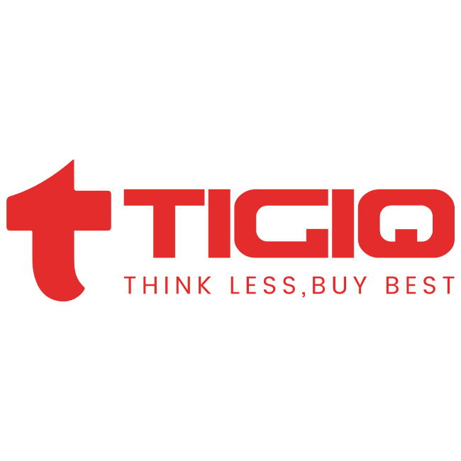
Tigiq is a dynamic, forward-thinking retail brand built on the promise of making every shopping experience simple, seamless, and satisfying. With the tagline “Think Less, Buy Best,” Tigiq positions itself as a trustworthy and convenient solution for consumers seeking high-quality, reliable products without the hassle of second-guessing their choices.
The challenge for Infinity Lord Design Studio was to create a bold and timeless visual identity that captures Tigiq’s essence—delivering simplicity, reliability, and confidence—while remaining versatile across various brand touchpoints.

Client: TIGIQ
Industry: Online E-Commerce Brand
Project: Logo Design
Design Objective
The primary objective was to craft a brand identity that visually conveys the brand’s core values: simplicity, quality, and ease of decision-making. The logo had to be clean yet impactful, allowing it to stand out in both digital and physical contexts. At its heart, the design needed to evoke trust and approachability while reflecting a premium feel.

Conceptual Development
The Tigiq logo was conceptualized as a harmonious balance of form and function.
Logo icon
- The Symbol
- The letter “T” takes center stage as a bold, iconic representation of the brand name.
- Its minimalist structure signifies trust and strength while reflecting the straightforward, “no-complications” promise of the brand.
- The subtle curvature of the “T” adds a modern touch, making the logo feel contemporary yet timeless.
- Typography
- A custom sans-serif typeface was designed for “Tigiq,” emphasizing clean lines and balanced proportions.
- The geometric structure of the letters mirrors the brand’s streamlined approach, ensuring clarity and readability across all applications.
- The Tagline
- “Think Less, Buy Best” is integrated into the logo lockup to reinforce the brand’s commitment to effortless decision-making.
- Its positioning and alignment work seamlessly with the overall design, maintaining aesthetic harmony.
Color Palette
The brand’s visual language is defined by its striking and memorable color scheme:
- Primary Color – Red (#E52B2C): A bold, confident shade symbolizing energy, passion, and trust. It reflects Tigiq’s ability to capture attention and stand out in the crowded retail market.
- Secondary Color – White (#FFFFFF): A clean, neutral tone that balances the boldness of red, adding a premium and professional touch to the brand identity.
The interplay of red and white creates a sense of clarity, simplicity, and modernity that aligns with Tigiq’s ethos.

Our other logo designs


Client Feedback
“Infinity Lord Designs has truly brought our vision to life. The packaging is not only beautiful but also tells the story of our brand. We are thrilled with the results and the positive response from our customers.”